Table of Contents

All the terms listed above have one major constant in common – they can all display a flameless candle. Take out QVC, and they NOW share a MAJOR component in mobile web design, and that is the ability to stuff about twice or thrice as many pixels within an image to serve up a crystal clear photo, or a graphic that is almost life-like.
Mobile website design and development is definitely on the rise, and with so many mobile devices on the market, all with different display resolutions, one concept that is growing tremendously is High Definition graphic displays on mobile devices. Apple calls it Retina display, and Android may call it qHD or QVGA.
What is a Retina Image Display?
Retina displays allow graphics and photos to become sharper and clearer on a display, this is done is by doubling (and sometimes tripling) the amount of pixels within a photo or graphic to enhance the quality of the image, hence making it HD.
Overall, retina display makes images appear more detialed and vivid on desktops, iPads, iPhones, Mac, MacBooks, and more. Apple, Inc. was the first to brand retina image display by using it in its first iPhone 4, by making screen images appear at 326ppi, or pixels per inch. Since then, this metric has been the main standard used to describe retina screen quality, with many new models since then including even greater number of pixels per inch.
What Does Using Retina Display Mean for Your High Definition Website?
This means that almost every image, icon, and graphic displayed on a Retina, qHD, or QVGA screen has to be doubled in size, but still keep the original size that was intended. When we save images in Photoshop, or any other advanced graphic editor for screen display, we used a DPI of 72 pixels. This is a standard resolution for saving files, because screen display resolution has a max DPI of 72 pixels per inch, or dots per inch. When formatting images for Retina displays, the 72 DPI is still used, but to increase the quality, we just double the actual dimensions of the image.
As web designers, we use pixels as a means for image measurement, so if we have a logo displayed on a web page on a non-retina display and it’s sized at 250 pixels by 100 pixels, then for retina displays, we have to increase it two-fold. Therefore, the retina version of the logo will be 500 pixels by 200 pixels.
“Wait, what?! Doesn’t that mean that the image will show bigger on the screen?!” Yes, it will, but we can specify the size of the image in the HTML or CSS. So we will force the browser to resize the 500px x 200px image to be 250px x 100px, which will keep the same proportions. To keep this simple, I will show you an example.
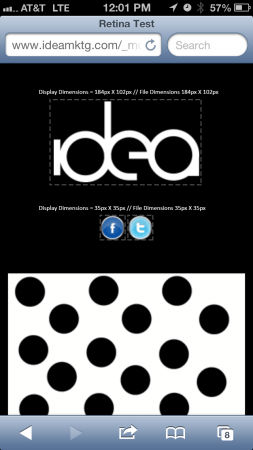
If you have an HD mobile device, and your images were not optimized for Retina displays, then the image will look something like this:
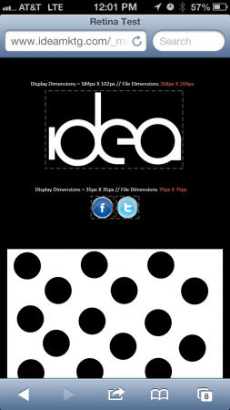
If you viewed these images on a Retina, or HD display they will look like this:
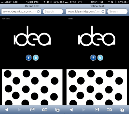
Opening these examples separately does not give justice, so here is a side by side comparison of both of the images.
As you can see, the images definitely have more detail and look much sharper on a Retina display. Just imagine how much more profoundly a retina logo would stand out on your website in comparison to standard pixilation.
What are The Effects of the Retina Resolution?
Although the images look awesome, there are a couple of downfalls in doing this. One of the downfalls of doing this is that you’re increasing file size, which means a user is using more of their precious bandwidth given by their provider, and with bandwidth caps happening on pretty much all of the major networks, this may be an issue.
The other downfall of using the retina resolution is what to do in case a person doesn’t have a Retina or HD display. Why must you make them suffer by downloading a higher quality version if they don’t need it? This is definitely an issue that is being discussed, but in reality, mobile sites are pretty much water-downed versions of their desktop site.
When a lot of imagery is being used on a desktop, we tend to tone down the mobile version to give the user a faster web experience. That way, the change is not that drastic, but if a client really wants to use certain imagery, there are ways that we can target non-retina displays versus retina displays, and all of that happens in the code.
The Future of HD Screens
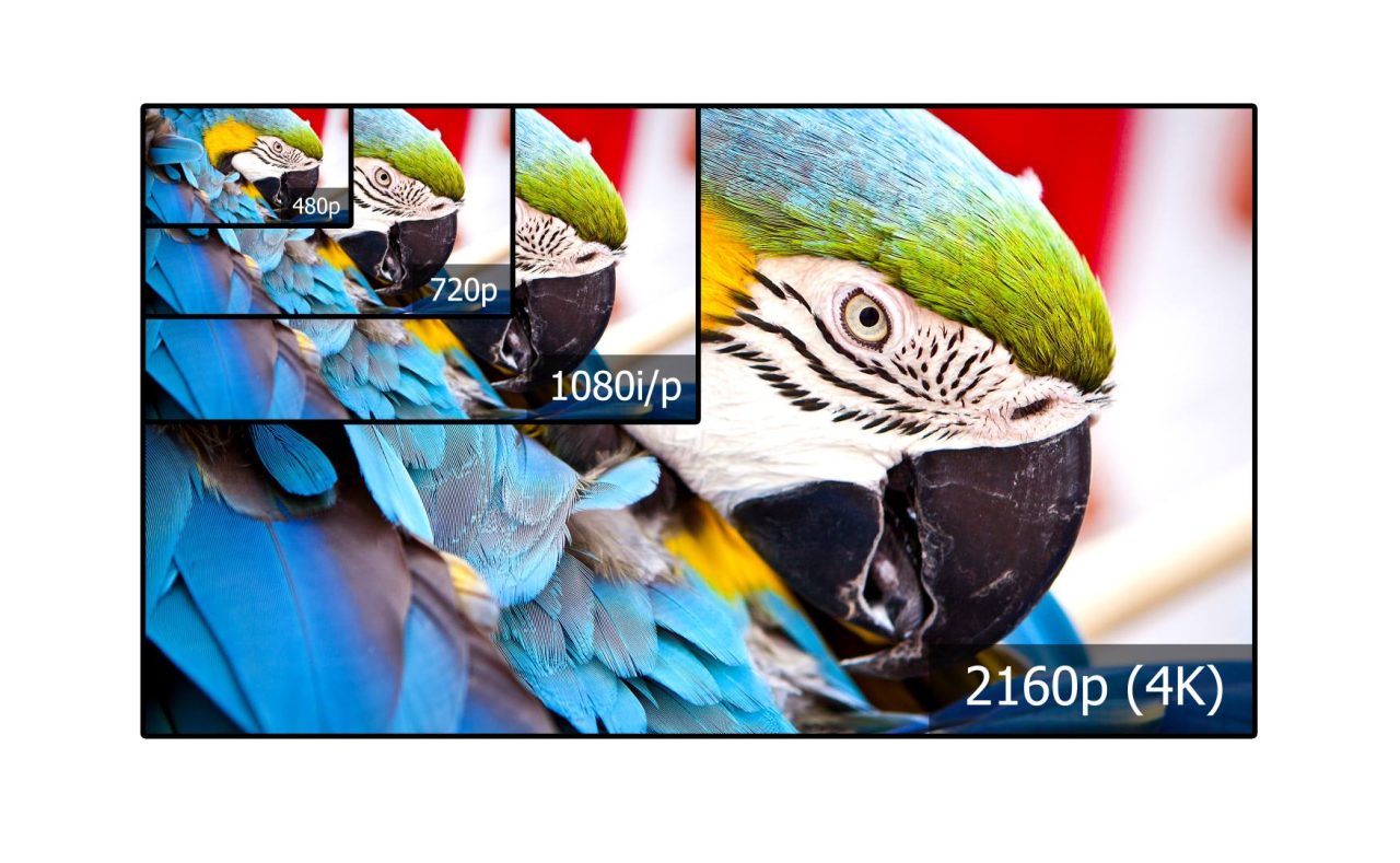
Right now, as we speak, HD screens are getting more advanced, and it just won’t happen on a mobile level. Apple has already made retina displaying laptops, which use the same concept, and Ultra HD flat panel TVs are starting to make their way into the markets. Pretty soon, 1080ppi will be 2160ppi, and displays will be crisper than ever.
Don’t even get me started on holographic website design. Even though Idea Marketing Group will definitely support designing within the holographic realm, we just don’t have the processing power to make that happen quite yet because dual hydro flux capacitors have been on backorder since 1985. Thanks, Doc Brown!
Anything you would like to add? Please comment below, or ask us about Responsive Mobile Web design, and how we can convert your existing site or a new site into a mobile-compatible website.
If you’d like to learn more tips about web design best practices, we have plenty! Here is some of our best web design advice to help you generate more leads and stand out from the competition:
Website Redesign Tips: When to Get a Website Redesign
Improving Your Website Design With Haley Langer
22 Best Web Design Terms for a Business to Know
How Top Creative Agencies Drive Results With Web Design
Why You Should Redesign Your Website When Preparing to Sell Your Business
Do you need any more assistance on your web development journey? Our Chicago WordPress developers and web designers can optimize your existing or new site with retina display, mobile compatibility, and other integrations to help you attract more leads and expand your business reach!


