What is User Experience (UX)?
A common misconception is that user experience design and web design are synonymous. However, UX design focuses on the way people use your product not just the way it looks. Aesthetics are very much a part of building websites that are engaging, but in the end setting up your users to easily navigate to the very thing they’re seeking out is far more pleasing to them, which is why it’s something business owners should take serious interest in.
When making a website it’s very easy to focus on meeting the demands of stakeholders and those involved in the approval process. The true challenge is going the extra mile to research and tailor a website to deliver the best possible experience for your target audience and potential new customers.
Google has a list of ten things they know to be true and number one on their list is no surprise: “Focus on the user and all else will follow.” In our experience, when it comes to making sure yout website has best user experience, the easiest way to know is to have a few individuals test it out (preferably coming from different demographics) and letting them tell you what causes any confusion.
What are the Benefits of Implementing UX Design?
The benefits for the customer are straightforward. The better experience they have, the happier they are. The happier your customers are, the more likely they are to return to your website. People make judgments rather quickly, so making the best impression as early as possible will help build brand trust and loyalty with your customers. Once trust has been established, you will see referrals to friends and family occur, leading to business growth.
Repeat customer sales and word of mouth can take you pretty far, but that’s only a small segment of what strong UX can provide to a business. User experience is a philosophy that extends to every branch of your business. From how customers are treated from their first call to customer service, to the simplicity of your product, and to the smallest bit of your website, e.g. the text-only FAQ section.
A company like Zappos.com is a great example of exceptional UX. The very second you cancel your order they offer you up a different size of the same shoe to re-order, give you a return shipping label and they’ll even expedite your shipment speed, all because they want you to feel like you’re trying on shoes from your couch.
Since most of the time your website is your customer’s first experience with your business, it’s a great place to answer their questions. Amazon goes one step further and uses a model that lets customer’s answer prospective buyer’s questions. Talk about implementing a feature that saves a business a lot of time and money. They’re completely hands off in that scenario.
The Process
The first step is finding out who your users are and what their behaviors are. Focusing on a user that is the most difficult to satisfy is generally the best approach.
The UX process is all about testing early and constantly evolving. This method proves to solve issues as early as possible in the design phase. Moving unproven concepts to development is a large business expense since design is far more flexible and efficient, especially if done using wireframes and prototypes.
An example of the iterative UX design process:
- Discover – Research users. Collect data. Analyze.
- Define – Create a process. Develop a workflow through wireframes.
- Design – Build structure, layout through a functional prototype.
- Test – Conduct A/B testing and application testing.
- Deliver – Get feedback from users.
- (Repeat)
Websites with best user exerience
Here are some great examples of websites that clearly pay attention to the needs of their users.
Virgin America
https://www.virginamerica.com

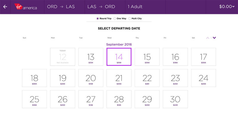
Virgin America is known for creating a great experience when booking a flight. As soon as you hit their page it pre-populates your departing city based on your current location. The flight booking process has all of your information laid out in front of you so that you are absolutely certain you aren’t making an expensive mistake. Switching your trip from one way to round trip is one-click, like most of your interaction on the site. The interface is free of clutter and creates no friction for the user whatsoever.
Airbnb

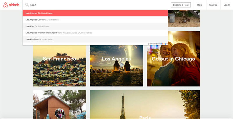
Airbnb is actually well-known for their stellar mobile app, but if you download the app and then go to their website you’ll see how cohesive their brand and UX are. There are so many details involved in securing a rental property and they deliver each one of them elegantly. Their split screen map and photo grid details are a great solution to deliver everything a user could need. They pay attention to the little things, like having the checkbox for changing the search results as you navigate to different locations on the map. The user interface design is delightful enough for you to want to come back…many times.
Netflix

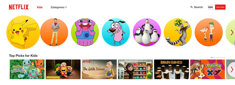
Netflix does a great job of learning user behavior. They have a darker theme for normal user profiles and a lighter theme if you are logged into a child’s profile. They have done some extensive A/B testing that has taught them things, like how swapping out media artwork can prove to get a much higher click rate based on imagery alone.
At Idea Marketing Group, we design and develop custom websites that are in-tune with the needs of your users. If you’re interested in learning more about our web design services, contact us today!


