Bird Brain Energy is a startup beverage company–or in the words of its founder, Joe Fornari, “a mental health company that makes an energy drink.”
From our early meetings, Fornari said the company’s mission was to elevate society’s mental health and performance by educating and empowering consumers to take control of their own health. He’s also committed to donating a portion of the product’s profits to broader mental health initiatives like America’s Vet Dogs, the Brain and Behavior Research Foundation, and the Cure Alzheimer’s Fund.

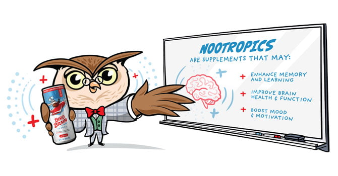
More than just a product, Bird Brain Energy drinks include supplements called Nootropics, which enhance memory and learning, improve brain health and function, and boost mood and motivation.
But, as a new company in an industry that has become very crowded, Bird Brain didn’t yet have an established brand or online presence. That meant Bird Brain had to look, sound, and feel different from the first to the last impression.
To break into the market and quickly establish itself in 2019, Fornari sought out Idea Marketing Group to design, develop and provide ongoing support for its first custom e-commerce website.
The Objective
Blending Health, Heart, and Humor Online
Bird Brain’s natural Nootropic health benefits highlighted focus, mental performance, and improved cognition (the “brain” in Bird Brain) and the company itself supports broader mental health initiatives. But, the visual brand, the messaging, and the tone of voice are intentionally contradictory.
Online, all three elements—the positive health benefits, the charitable give back, and the quirky, irreverent humor–had to play well together.

The Solution
What did I just see?
As a team, we mapped out the user flow throughout the entire website to make sure the customer journey provided an experience and not just an online shop. To do that, we used several graphic elements to create dynamic movement throughout the site.
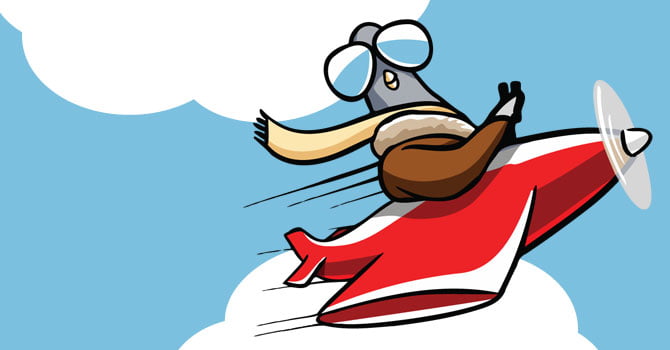
On the homepage, for example, the user’s eye is drawn first to a billboard explaining the scientific benefits of the drink, but then quickly to the Bird Brain mascot (“The Adventurer Bird”) who appears to be flying past (an effect created by the clouds in motion behind him). The bird is looking back over its shoulder towards the billboard, which draws the user’s attention back to it a second time for a deeper read-through. We created this experience to resonate with people who struggle to focus as they’re constantly bombarded with ads throughout the day.
As users scroll down the homepage, they’re introduced to a second Bird Brain mascot (“The Professor Owl”). His job is to deliver the science behind Nootropics on a whiteboard, referencing the experience young professionals have sitting in soul-sucking company meetings.
The homepage, which closes with vibrant images of the product, a clear “BUY NOW” button, and a list of organizations Bird Brain supports, provides an experience for the customer journey and the Bird Brain brand itself, which allows both to stand out in the energy drink space.
On deeper pages, the Bird Brain team leaned into its jarring tone of voice with bogus employee bio pages, attention-grabbing pop-up boxes and overtly blunt calls to action. By leveraging “Did they really just say that” copy that contradicts the drink’s serious health benefits and the company’s charitable side, Bird Brain allows customers to embrace a lighter, nonsensical tone while doing good for their health and others at the same time.
Beginning with the business, the customer, and the end in mind
The custom energy drink website was built on WordPress and the e-commerce platform was created in WooCommerce.
When its website launched, Bird Brain Energy only had one flavor (original citrus), available in a 4-pack or a 12-pack. So, its initial e-commerce shop design focused on delivering visual flair in line with its brand while making it as easy as possible for customers to purchase the energy drinks.
Knowing Bird Brain wanted to eventually expand its online shop, we chose WooCommerce. Its security, flexibility within WordPress, and nearly countless integrations meant we could customize the platform to grow with the company after launch.
“It seems like every single day a new problem arises that you can’t foresee,” Fornari said. “It’s an e-commerce site so there are a lot of moving parts and that takes a lot of expertise. I knew I was going to need a little bit more flexibility and customization and Idea was the perfect fit.”
Since launching the website, our custom approach has improved business processes for Bird Brain by leveraging WooCommerce plugins that offer shipment tracking, tax automation, and ship station label printing.
“You’re not only selling your product online, you’re also selling your brand itself,” said Dan Steinmiller, Idea Marketing Group Front End Developer. “A basic ecommerce install might suit your needs initially, but you’re likely to do better business by providing a more professional experience to your customers. When your website shows you’ve invested in the platform, it creates trust.”
Post-Launch Website Support
The Wind Beneath Bird Brain’s Wings
Bird Brain’s relationship with Idea Marketing Group continues today. The company leveraged a monthly support and maintenance package that allows for long-term growth at a measured pace.
Since launch, we’ve given customers a choice in how they pay for their beverages by adding PayPal in addition to the standard credit card option. Customers–rather loyal brand fanatics–can also snag Bird Brain SWAG. These shirts, hats, and stickers help increase brand awareness for the bold upstart.
To help Bird Brain engage with its website visitors, we also added a blog section. As more products have become available, we’ve added capabilities to the product pages that allow users to find more information through collapsible accordions without negatively affecting their site experience.
When our support manager, Haley Langer, isn’t optimizing the site’s cache and improving loading speed, she’s recording and sending brief training videos to help Fornari and his team learn more about the Bird Brain website and become more confident making simple fixes in the future so they don’t have to rely on a third-party agency.


