Your Business Logo is Your Marketplace Identifier
Every business needs to have a logo, an easily recognizable identifier that customers come to associate with your services or products. Unfortunately, as critical as logos are, it’s not so easy to make a great one. A logo can easily make or break the way customers perceive your business and how they view your professionalism. In fact, Finance Online reports that 60% of customers avoid a brand that has an odd, unattractive, or unappealing logo.
We’ve all witnessed it before, a logo that is just, well scary. You know the kind – cluttered, complicated, and cliche. Some may call it “classical,” but in reality, it probably just hasn’t been updated since the dawn of the internet. You or someone you know may be suffering from a scary logo if you answer YES to any of the following statements:
- You’re afraid to show it to your customers
- Your salespeople cringe every time they send proposals out
- Your designer dies a little inside every time you create new marketing materials
We get it, logos can seem to entail complicated design, functionality, and knowledge of user experience. It’s your business icon that needs to convey your product or service to customers, while also clearly distinguishing your business from the competition. As a top-rated Chicago web design company, we’ve seen our share of bad logos (they haunt us). We also know what it takes to create a great logo that customers don’t cringe at the sight of, and more importantly, will remember later on when they’re in the purchasing mindset.
Why Logos Are Important for Your Brand Identity
Why do you need a logo and why is a logo important to your business success? In essence, we live in a world that is organized by symbols that relate certain meanings and affect our perception of the world. As we live our lives, we are constantly interacting with cues of meaning that we then filter through our own understanding of our own reality. These perceptions impact us deeply and any time we come across them, certain emotions and mental images are evoked as a response.
That is also the power behind a great business logo! Its symbolism conveys positive associations that align with our needs and desires. Quintessentially, a well-designed logo is a symbol that represents a business, its mission, and its values, and conveys the business’s unique value proposition. It communicates your brand’s attributes by showcasing your colors, sensibility, personality, fonts, and shapes. It tells your story that influences customers on an emotional level and ensures that it is memorable and stands out from the rest.
So what are consumers looking for when they engage with a logo? They mostly look for logos that are consistent, easy to understand, attention-grabbing, unique, and timeless.
Does your logo fit this bill? Keep reading to see what you should avoid so that you can create a logo that truly captures your value proposition and stands out from the rest!
The 7 Deadly Sins of Logo Design According to the Experts
To help you come up with a better logo design, our team of website marketers, graphic designers, and logo design makers sat down to create a 7 Deadly Sins of Logo Design list to help you evaluate your own logo and find ways to better represent your brand.
- First on our list is Cluttered. These logos are just trying to convey too much information. And all this really does is cause cognitive dissonance and confusion for the customers. We tend to keep in mind the KISS strategy when designing and evaluating logos – or, keep it simple stupid. Too much going on leads to too much confusion.
- What you should strive for is a Clear logo design. These logos convey only the necessary information, so visitors immediately “get it” and have a visceral feeling for what to expect from the brand and its products or services.
- The second sin is a logo that is way too Complicated. You’ll notice these logos are stuffed with fluff and noise – fonts, colors, and clipart… oh my. While we love to see creative and unique designs, they also shouldn’t look like a collage of Photoshop throw-up.
- What we recommend is keeping it Clean. Remember that with logo design, less is more. When we design a logo, we make use of negative space. This style gives you versatility and is easily replicable on all platforms and materials (from t-shirts and business cards to billboards). When there’s less going on with your logo, there’s less that can go wrong.
- Another common logo sin is a design that’s Common Place. A logo that evokes this generality will not speak to or attract your ideal client. They either ignore it, or worse yet, it repels your target audience that is likely niche.
- What you want to aim for is a logo design that is Compelling. These types of logos appeal to the target audience you want to attract and will truly resonate with their own sense of trust that you are the right business to help solve their problem. Having a logo that connects with your customers is essential in today’s saturated marketplace.

- This one should be a given, but a Constantly Changing logo is a big no-no. Inconsistency from one platform to the next is confusing for customers and hurts your brand.
- Instead, keep your logo consistent across platforms. The visual experience should not change from one platform to the next. In this way, there is no violation of the expectations of your customers whether it involves your website, social media, signage, brochures, or business cards.
- Next is Crude. These logos only convey a fragment of what you do, and the value you provide to your customers. They also signal to customers that your branding is not important or a priority for you. Crude logos don’t do anyone any favors.
- What you should aim for is a Cohesive logo that encompasses a complete visual representation of your brand. This kind of logo ties everything together in a functional way. When your logo is well thought out and represents your brand’s identity markers – brand colors, style, product symbolism, and mission – your customers will take notice.
- Another common sin we see is logos that appear Cliche. Using fonts and styles that quickly become a passing fad results in a short usable lifetime for your logo before you will need a redesign. When your logo looks outdated, your customers will likely think your products or service are too.
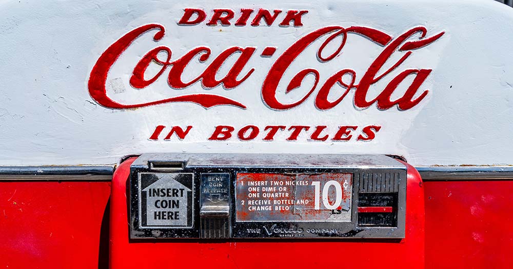
- Instead, businesses should strive to have a logo that is Constant. This logo should stand the test of time (even as your brand and business evolve). A timeless logo is easily recognized and remembered by potential customers. Even if at some point you want a refresh for your logo, it can be updated with small tweaks and fixes to a logo design that is still distinctly recognizable, as long as it avoids the 7 deadly sins of logo design advice. Think of Coca-Cola’s logo evolution over the years.
- The final logo sin on our list is Cheap. A cheap logo doesn’t accurately represent the value that you provide, and you certainly don’t want customers viewing your business as cheap.
- Rather, you want to create a logo that’s Complimentary to your brand. Use colors and fonts that would best represent your identity and target audience. When designing a logo, focus on the feeling you want customers to have when they see and interact with your logo. Does it convey the essence of what you do and what you have to offer?

That concludes our list of the 7 Deadly Sins of Logo Design! We hope these best practices help you when considering your next logo design, or give you something to think about if you’re looking to redesign your current logo. By following these guidelines, you will be able to improve your brand awareness and attract the right leads that are likely to turn into customers.
And if you have some great ideas for your logo but need assistance in flushing them out and bringing them together stylistically in a powerful way, we are happy to assist! At the Idea Marketing Group, we have expertise in designing all types of logos, whether you are looking for a logo design with a name or a more complex stylized logo that expresses your niche distinctiveness. Get a free consultation today!


